Dropdown mobile Nav buttons
Finally!
Get your mobile Navigation back to the top of the page, right where you always wanted it to be!
The code is running on this page. So, take a look at it on your mobile to see how well it works...
The Navigation area on a standard BB2 mobilized page appears half way down the page under the Content area.
Many people find this counter-intuitive.
We've developed a technique that
- brings the Navigation back to the top of the page and then
- hides it under an easily recognized Menu button
What does it look like?
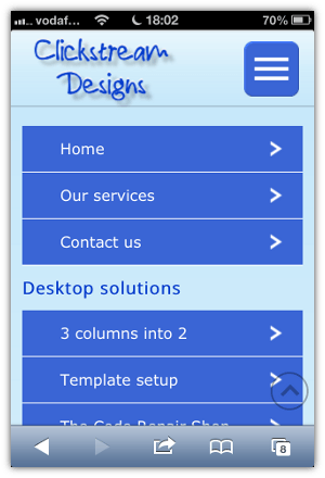
The first image is a screenshot taken direct from an iPhone 4.
It shows the page as it appears to the visitor when they first arrive at your site.
We've added the red arrow to point to the new Menu button.


The second image is how the page looks after the visitor has pressed the button and the Menu opens up.
How does it work?
When the user taps the button, the menu opens, and the content slides down the page.
When the users taps the button again, the menu closes and the content slides back up the page.
Tapping the logo takes the visitor to the Home page.
This is what most visitors expect to happen on a mobile.
What's involved?
- This technique uses the standard SiteBuilder Navigation Block. When you add new T2 pages to your site, they are automatically added to the dropdown list on your mobile as well. You don't have to do anything extra.
- We hide the default "Full Site" and "Navigation" buttons in the toolbar at the top of the page
- We create a new top of the page area, that lives inside a Site Wide dot in the Header
- Your site logo is turned into a link back to the Home Page
- The Navigation button is in your site's colors, and is linked to the regular BB2 Navigation Block
- We hide the standard Mobilize It Navigation area that appears underneath your Content
Take a look at this page on your mobile, and you'll see how easy it is to use!
And don't forget the Footer ...
While you're at it, it's a golden opportunity to put your Footer back at the bottom of the mobile page where it belongs.
Just like we've done on this page!
Contact Us
If you want to get these changes made to your web site, get in touch with us via our Contact page.

